Slider has been used very widely to design WordPress Website over past few years. Both static and automatic slider has been of great benefit- especially yo display galley and post content. You can see a slide integrated in homepages and static pages of many website. Today, we will learn to use the slider Widget by UltraPress.
How to add a Slider?
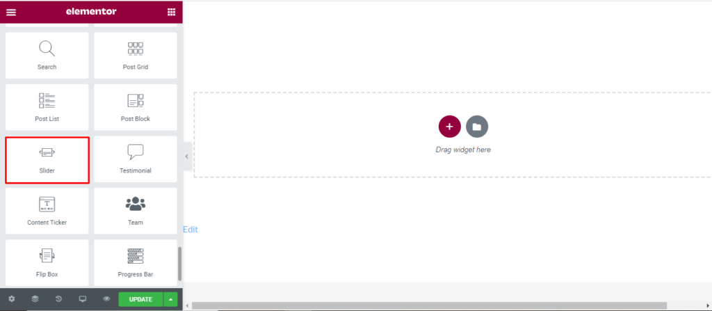
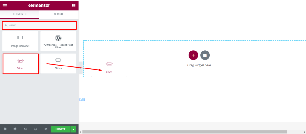
Open the page where you want to add the Slider and click Edit with elementor. Then in the search widget box, type “Slider”. Now drag the Slider widget to the region you need to add the widget.
Once you drag the widget in the place you need, it should look like this.
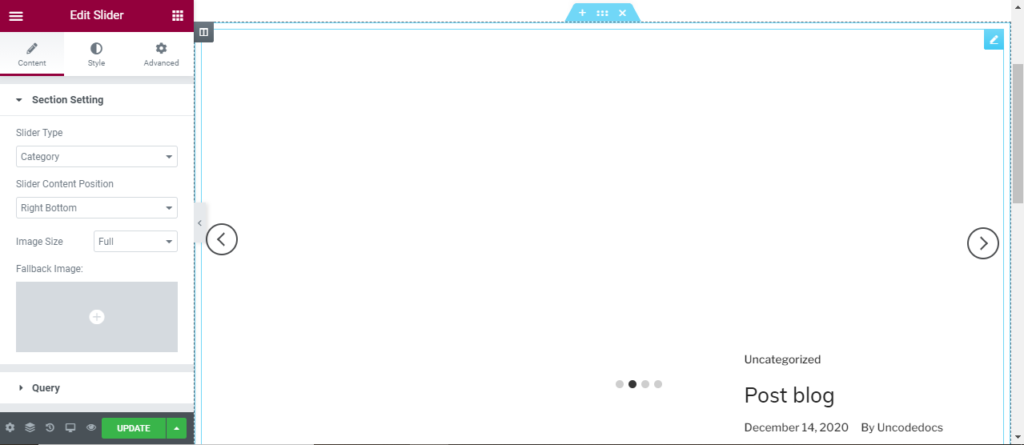
Content
Section setting
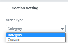
Slider Type: You can either used the slider provided by the theme or custom every slide as per your need.
Slider Content Position: Here, you can shift the slider content to any place of the site.
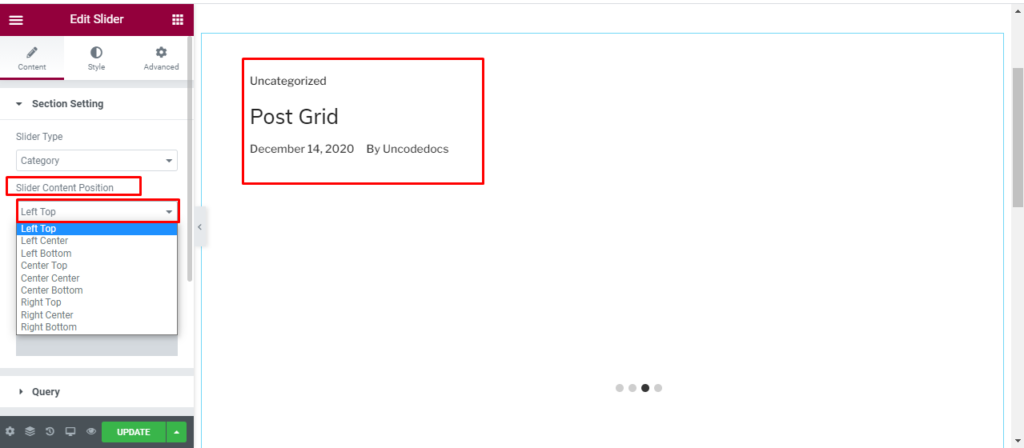
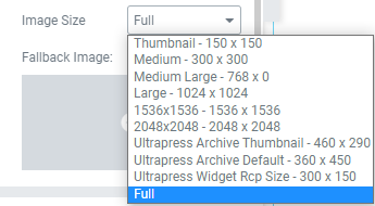
Image Size: Since most on the content in column are displayed with image, you can set a default size or change the image size.
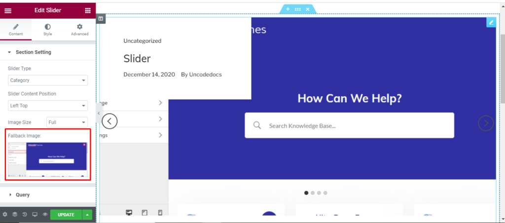
Fallback Image: Here, you can add a default fallback image for all post.
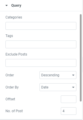
Query:
Here, you can set the categories, Author, and tag. You can also exclude some post if you don’t like it. You can arrange the post in ascending or descending order as per date, Comment, Author and so on.
With offset, you can determine the number of initial post you want to skip.
With No of post, you can display more or less number of post.
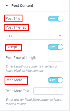
Post Content
Here you can find multiple editing options for both Main post and Secondary Post.
Post title: You can either hide or display the post title.
Post title tag: You can change the heading of Post title tag to make the title appear smaller or bigger.
Excerpt: You can hide or show the excerpt that has been Witten in your blog post.
Read more: You can enable or disable read more option and also change the “read more” text to “show more”, “know all” or whatever you like.
Post Meta
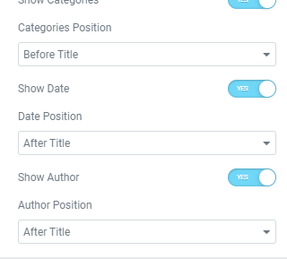
Show category: You can either hide or display the category from this section and also determine it’s position.
Show date: You can either hide or display the date from this section and also determine it’s position.
Show author: You can either hide or display the author from this section and also determine it’s position.
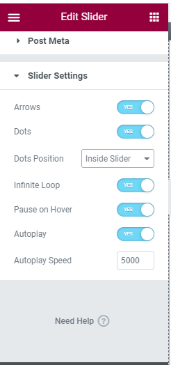
Slider setting
Arrows: You can enable or disable the use of arrows.
Dots: You can enable or disable the use of Dots. You can also set the dot position to Inside slider or outside slider.
Infinite Loop: You can enable or disable the use of Infinite loop. Enabling this feature display the initial content once it display the last content.
Pause of Hover: You can enable or disable the use of Pause of Hover.
Auto Play: You can enable or disable the use of AutoPlay. You can also set the time for AutoPlay.
Style
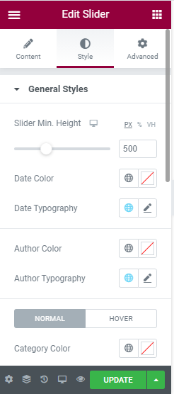
General style: In this section, You can edit the slider minimum height. Also, change the color and topography of Date and Author. For the category, content title, and content description, you can change the color and typography for both normal and hover condition.
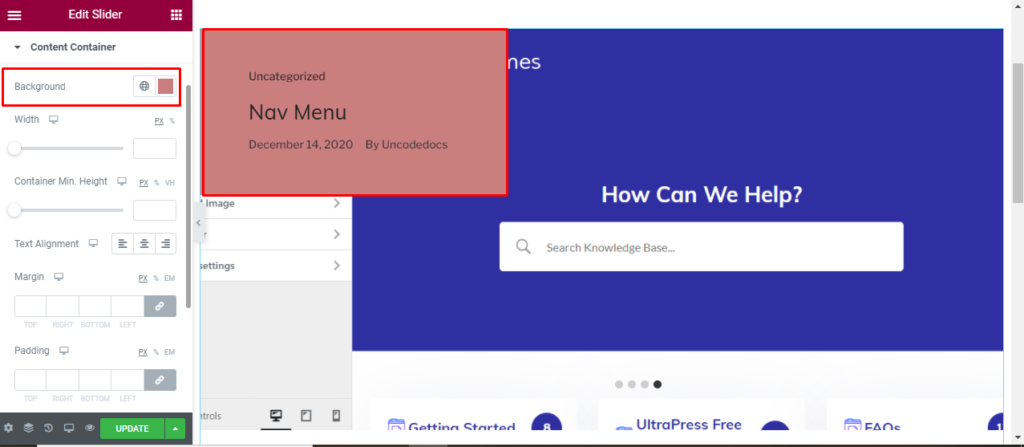
Content Container: Here you can change the color, width, height, text alignment, Margin, and Padding of content container.
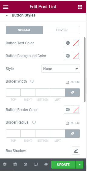
Button Style: Here you can change the button style for “Show more” section. You can change the Button text color, Button background color, style, and border width for both normal and hover. For the button border, you can change the color, radius, and shadow. The Change in button typography along with Margin and Padding is also done.
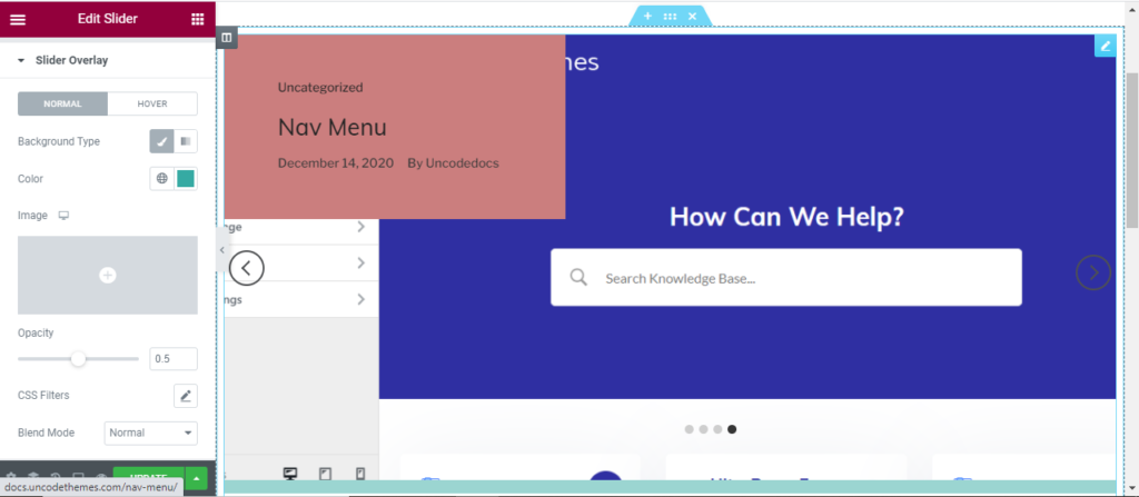
Slider Overlay: You can either add image or gradient as slider overlay for different and hover condition.