Content Ticker will allow you display your latest and trending news with awesome animation effects. Add ticker type as custom or dynamic and provide an stunning look that attracts the audience. Content ticker widget is useful to highlight your most popular content as well as feature content so that you can drive the visitors to important things.
UltraPress provides beautiful content ticker and allows multiple modification. Let’s learn in detail.
How to add Content Ticker?
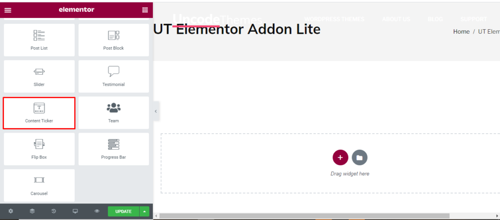
Open the page where you want to add the Content Ticker and click Edit with elementor. Then in the search widget box, type “Content Ticker “. Now drag the Content Ticker widget to the region you need to add the widget.
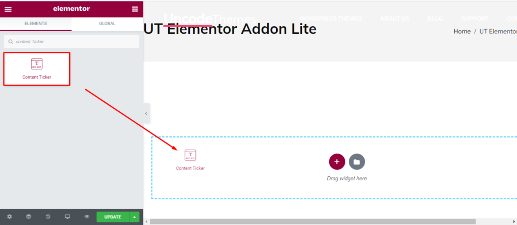
Once you drag the widget in the place you need, it should look like this.
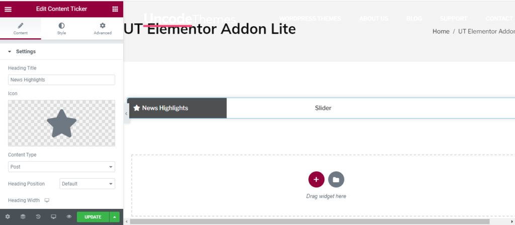
Now you can start to edit the content.
How to use Content Ticker widget?
Content
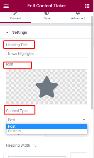
Heading: This is the place to display the heading to the content. For eg: you can write “Trending”, “Highlights” and so on as heading.
Icon: On the left, you can add can attractive icon to please the viewers.
Content Type: You can either display your latest post for show the custom post only.
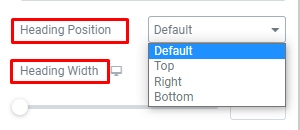
Heading: Heading position and width can also be modified here.
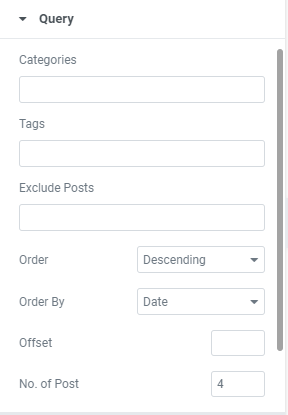
Query:
Here, you can set the categories, Author, and tag. You can also exclude some post if you don’t like it. You can arrange the post in ascending or descending order as per date, Comment, Author and so on.
With offset, you can determine the number of initial post you want to skip.
With No of post, you can display more or less number of post.
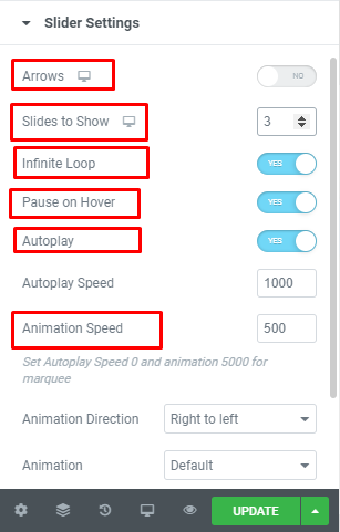
Slider setting
Arrows: You can enable or disable the use of arrows.
Slides to show: Choose between one to four slides to be displayed at a time.
Infinite Loop: You can enable or disable the use of Infinite loop. Enabling this feature display the initial content once it display the last content.
Pause of Hover: You can enable or disable the use of Pause of Hover.
Auto Play: You can enable or disable the use of AutoPlay. You can also set the time for AutoPlay.
Animation: You can add animation to the slider and change it’s speed, and direction (Right to Left) by default.
Style
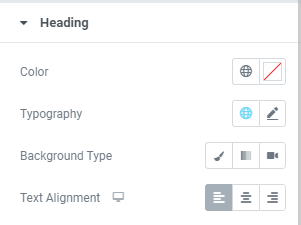
Heading: In this section, You can edit the color, topography, background type, and alignment of Heading.
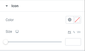
Icon: Icon color and size can be changed here.
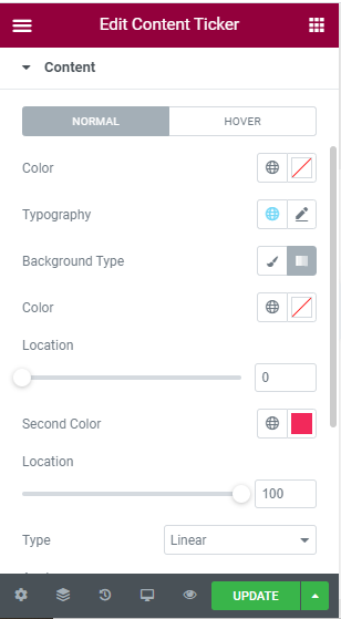
Content: For the main content, you can change color, typography, and background type for Hover and normal.
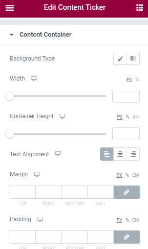
Content Container: Here you can change the background, color, width, height, text alignment, Margin, and Padding of content container.