By Using the Image Comparison widget you can compare two images and give an attractive before and after slider effect. With our image comparison elementor widget, you can compare the image by selecting vertical or horizontal with motion effects, customize label color, typography, background type, margin, padding and many more for before and after images.
How To Add Image Comparision?
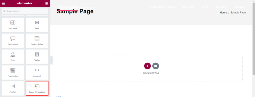
Open the page where you want to add the Image comparison and click Edit with elementor. Then in the search widget box, type “Image Comparison”. Now drag the Image Comparison widget to the region you need to add the widget.
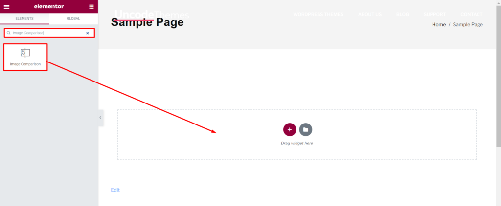
Once you drag the widget in the place you need, it should look like this.
How to use Image Comparision?
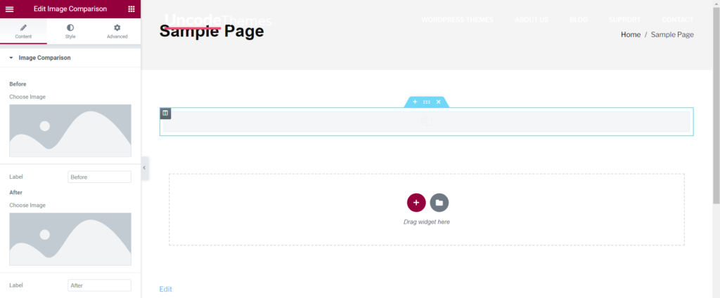
Content
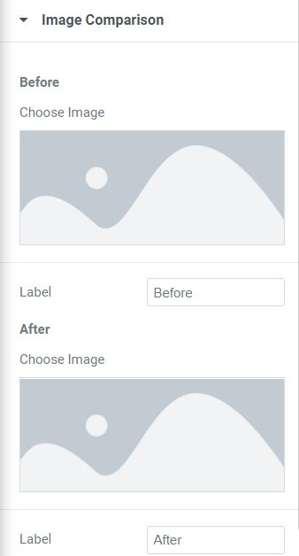
Image Comparison
Before: Choose image to be shown in before and add label.
After: Choose image to be shown in after and add label.
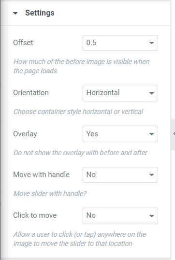
Settings
Offset: The offset value can be set for how much of the before image is visible when the page loads.
Orientation: Choose container style horizontal or vertical.
Overlay: This option allows to choose whether to show overlay with before and after or no.
Move with handle: This option allows to choose whether to move slider with handle or no.
Click to move: Allow a user to click or tap anywhere on the image to move the slider to that location.
Style
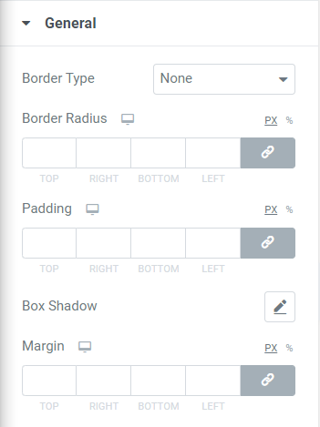
General
Border Type: The border type None, Solid, Double, Dotted, Dashed, Groove.
Border Radius: This option allows to set border radius for Top, Right, Bottom, Left.
Padding: The padding can be set for Top, Right, Bottom, Left.
Box Shadow: The box shadow can be set as color, Horizontal, Vertical, Blur, Spread.
Margin: Margin can be set at Top, Right, Bottom, Left.
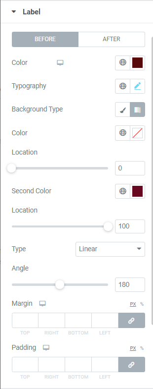
Label
Before: For before label you can set Color, Typography setting, Background Type, Color, Location, Second Color, Location, type, Angle, Margin(Top, Right, Bottom, Left), Padding(Top, Right, Bottom, Left).
After: For after label you can set Color, Typography, Background Type, Padding(Top, Right, Bottom, Left).
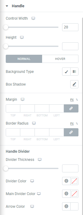
Handle
Control Width: The control Width can be increased or decreased.
Height: This option allows to set height for handle.
Normal and Hover
Background Type: The background type can be set through various settings as color, location, second color, type, angle.
Box Shadow: The box shadow can be set for handle.
Margin: Margin of handle can be set at Top, Right, Bottom, Left.
Border Radius: Border Radius of handle can be set at Top, right, Bottom, Left.
Handle Divider: Divider Thickness, Divider Color, Main Divider Color, Arrows Color can be set for handle divider.