By Using the Fun fact elementor widget you can showcase the number, statistics, achievements, and facts in a progressive number counter. These animated number counter widgets help to customize the background, icon, and format to display your number counter accordingly. Our Fun Fact element offers lots of styles like elementor fun fact box-shadow style, fun facts with fill icon box, number counter radius with border icon box, WordPress animated number counter style.
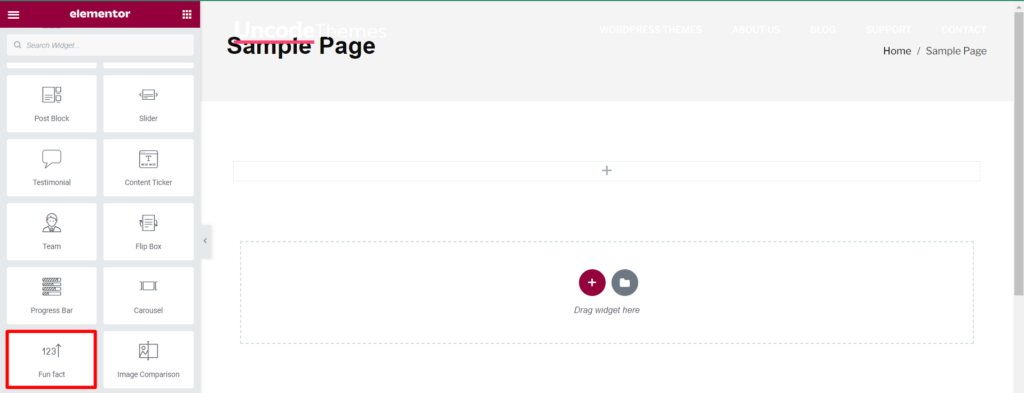
How To Add Fun Fact?
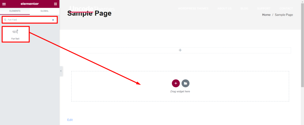
Open the page where you want to add the Fun Fact and click Edit with elementor. Then in search widget box type “Fun Fact”. Now drag the Fun Fact widget to the region you need to add the widget.
How To Use Fun Fact Widget?
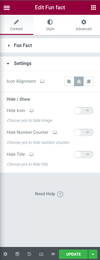
Content
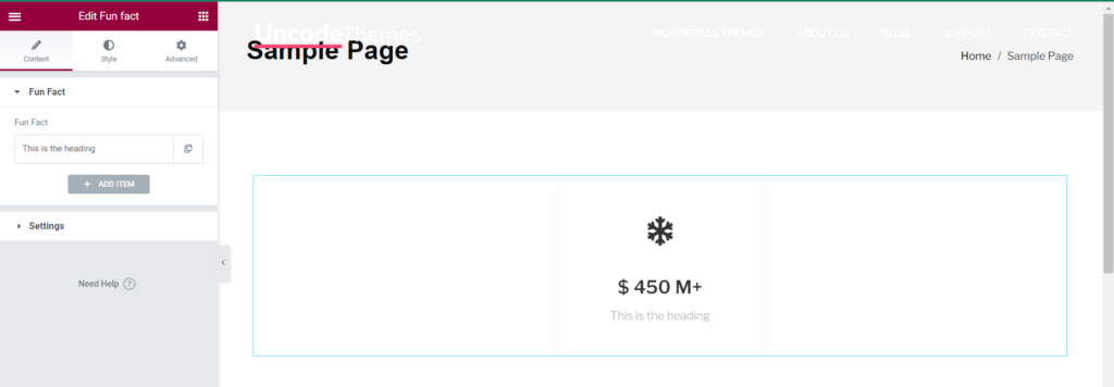
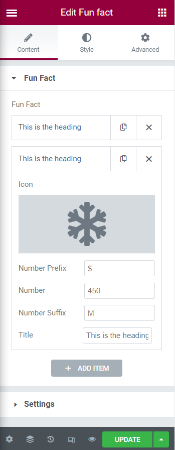
Fun Fact: The Fun Fact consists of various contents as Heading, Icon, Number Prefix, Number, Number Suffix, Title. Through ADD ITEM multiple icons can be added alongside of each other. Icon can be set through Icon Library or Upload SVG.
Settings
Icon Alignment: The icon can be aligned Left, Center, Right of its block.
Hide/Show
Hide Icon: Enabling Hide Icon disables the icon.
Hideo Number Counter: Enabling Hide Number Counter disables the number counter.
Hide Title: Enabling Hide Title disables the title.
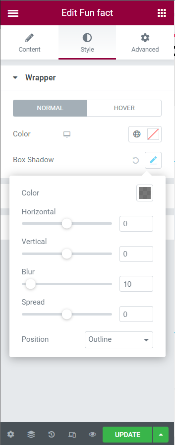
Style
Wrapper
Normal: Color, Box Shadow(Color, Horizontal, Vertical, Blur, Spread, Position(Outline, Inset)) can be set.
Hover: Color, Box Shadow(Color, Horizontal, Vertical, Blur, Spread, Position(Outline, Inset)) can be set.
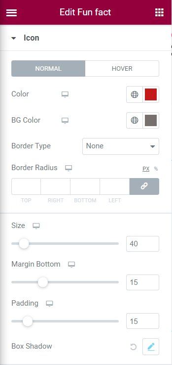
Icon
Normal
Color: This option allows to define color for icon.
BG Color: This option allows to define background color for the icon.
Border Type: The border option available for icon are None, Solid, Double, Dotted, Dashed, Groove.
Border Radius: The border radius can be set for Top, Right, Bottom, Left.
Size: This option allows to vary the size of the icon.
Margin Bottom: This option allows to set margin bottom.
Padding: This option allows to set the pading.
Box Shadow: The box shadow can be customize with options as Color, Horizontal, Vertical, Blur, Spread, Position(Outline, Inset).
Hover
All the options available for Hover are same as Normal except following mentioned options.
Primary Color: This option allows to set primary color for icon hover.
Secondary Color: This option allows to set secondary color for icon hover.
Content
Number Count
Number Color: This option allows to define color for number.
Top Spacing: This option allows to set top spacing value for number count.
Bottom Spacing: This option allows to set bottom spacing value for number count.
Right Spacing: this option allows to set right spacing value for number count.
Title
Spacing: This option allows to set the spacing below the title.
Color: This option allows to define color for the title.
Typography: The typography settings available are:
Family: There are wide range of family type available for title.
Size: The size for the title can be customize through various option as (PX, EM, REM, VW), Weight(Default, Number, Bold, Normal), Transform(Default, Uppercase, Lowercase, Capitalize, Normal), Style(Default, Italic, Normal, Oblique), Decoration(Default, Underline, Overline, Line Through, None).
Line Height: Line height can be set in PX, EM.
Letter Spacing: Letter spacing can be set in terms of number.
Word Spacing: Word spacing can be set in terms of number.
Padding: Padding can be set for Top, Right, Bottom, Left.