If you need to display multiple blog post content or other content in a single page, you will need to keep them in well arranged list. Listing multiple post in an elegant way will help the users to located the content they need. Let’s learn to organize your entire content in a single page as you list them out in a beautiful way. Let’s learn how.
How to add Post List?
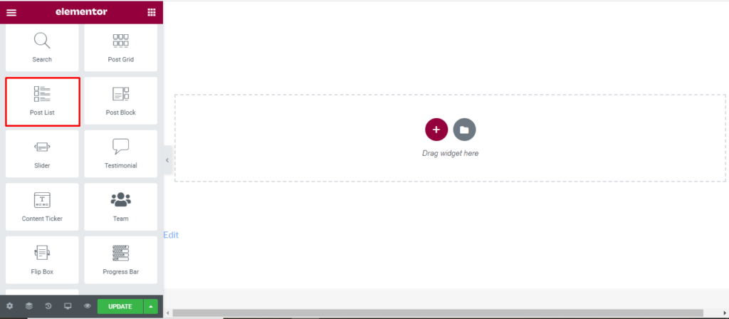
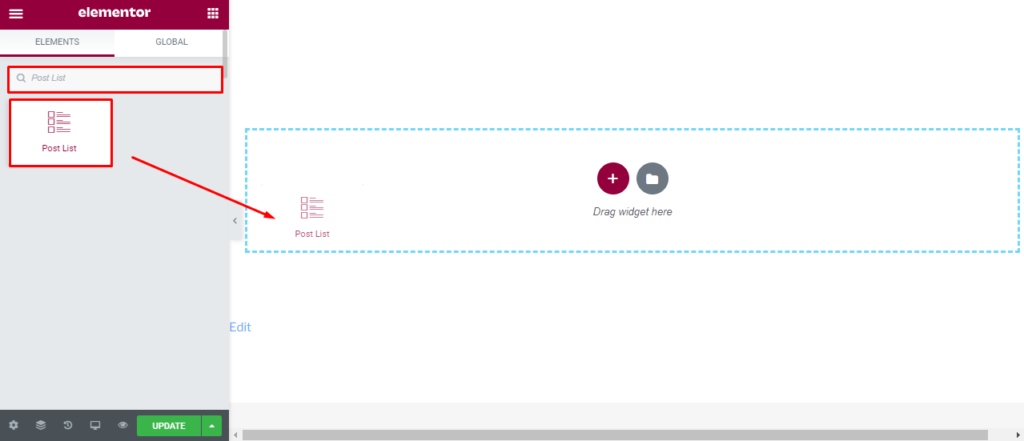
Open the page where you want to add the Post List and click Edit with elementor. Then in the search widget box, type “Post List”. Now drag the Post List widget to the region you need to add the widget.
Once you drag the widget in the place you need, it should look like this.
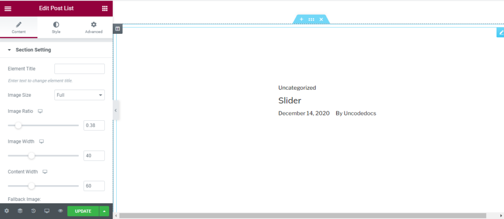
Now you can start to edit the content.
How to use Post Grid widget?
Content
Section setting
Element Title: First, you can add title to your gird. Here, we have added Blog post as our title.
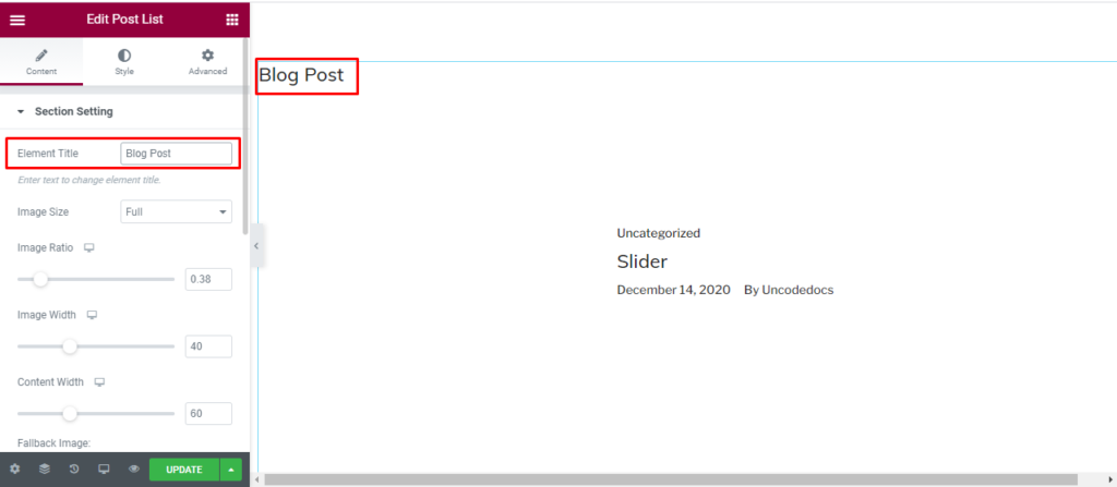
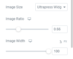
Image: Since most on the content in column are displayed with image, you can set a default size, ratio, and widget for all the images used in the post grid section.
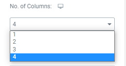
Number of Column: You can choose the number of column from 1 to 4 as per your wish.
Enable Carousel: You can enable Carousel to insert the slideshow feature.
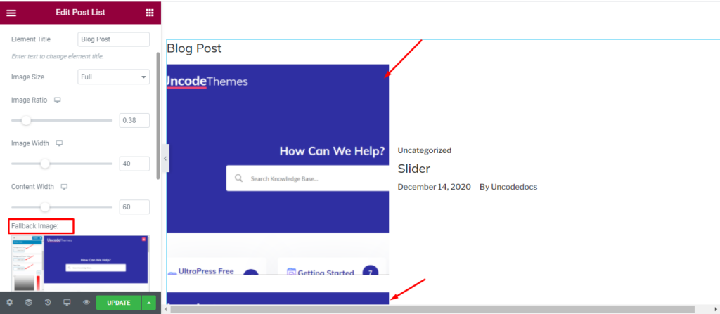
Fallback Image: Here, you can add a default fallback image for all post.
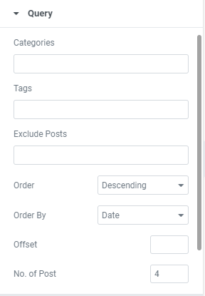
Query:
Here, you can set the categories, Author, and tag. You can also exclude some post if you don’t like it. You can arrange the post in ascending or descending order as per date, Comment, Author and so on.
With offset, you can determine the number of initial post you want to skip.
With No of post, you can display more or less number of post.
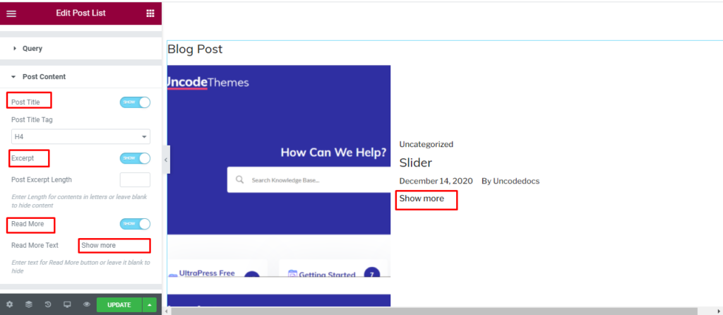
Post Content:
Post title: You can either hide or display the post title.
Post title tag: You can change the heading of Post title tag to make the title appear smaller or bigger.
Excerpt: You can hide or show the excerpt that has been Witten in your blog post.
Read more: You can enable or disable read more option and also change the “read more” text to “show more”, “know all” or whatever you like.
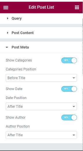
Post meta
Show category: You can either hide or display the category from this section and also determine it’s position.
Show date: You can either hide or display the date from this section and also determine it’s position.
Show author: You can either hide or display the author from this section and also determine it’s position.
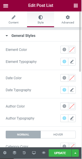
Style
General style: In this section, You can edit the color and topography of Element, Date, and Author. For the category, content title, and content description, you can change the color and typography for both normal and hover condition.
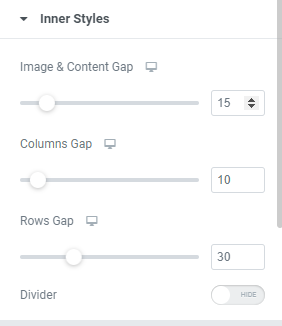
Inner style: Firstly, you can increase or decrease the image and content gap along with column and row gap. These changes are visible for desktop only.
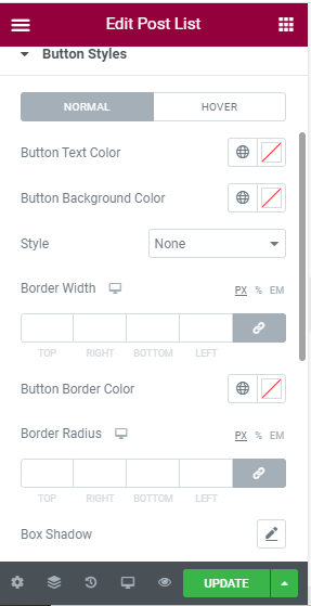
Button Style: Here you can change the button style for “Show more” section. You can change the Button text color, Button background color, style, and border width for both normal and hover. For the button border, you can change the color, radius, and shadow. The Change in button typography along with Margin and Padding is also done.
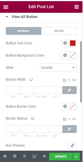
View all button: You can also add a view all button. Button text color, button background color, and Style can be changed. Also, you can edit Border width, button border color, border radius, and box shadow.
Advanced
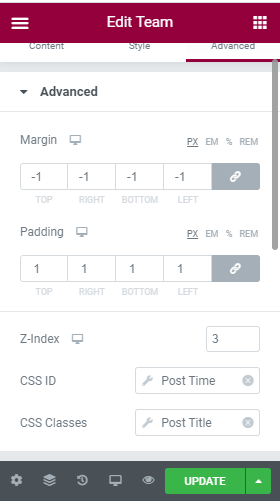
Advanced: Here, you can increase or decrease the margin between the column, and change the padding. Other options are Z-index for desktop, CSS ID, and CSS classes.
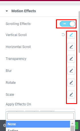
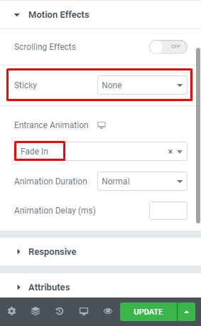
Motion effect: You can make your team section even more elegant by enabling the motion section. Once it is enabled, you can make other changes in the speed and looks. You can also enable or disable mouse effect, make it sticky to the top or button, and lastly change the entrance animation.
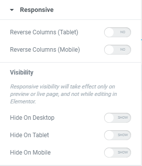
Responsive: You can make your team content responsive for tablet, Mobile and Desktop using this section.
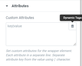
Attributes: You can set the custom attributes for the wrapper element. You can also use the dynamic tags.
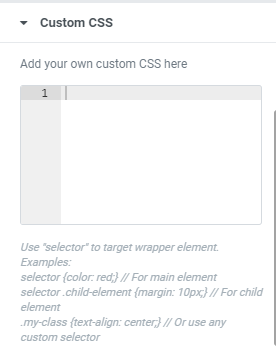
Custom CSS: Lastly, if all of these features are not enough, you can add your own CSS code here.