Using the Icon box widget allows you to display a short brief about the services you provide or products you offer within boxes and slider with customization options like icon type, badge, content, icon box container, background, overlay, etc. Let’s learn how to use it.
How To Add Icon Box?
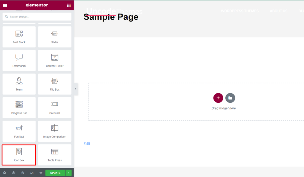
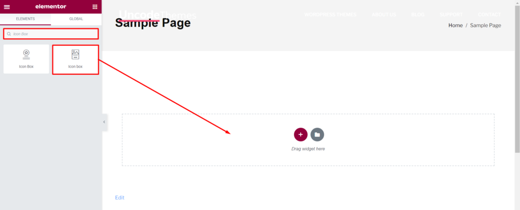
Open the page where you want to add Icon Box and click Edit with elementor. Then in the search widget box, type “Icon Box”. Now drag the Icon Box widget to the region you need to add the widget.
Once you drag the widget in the place you need, it should look like this.
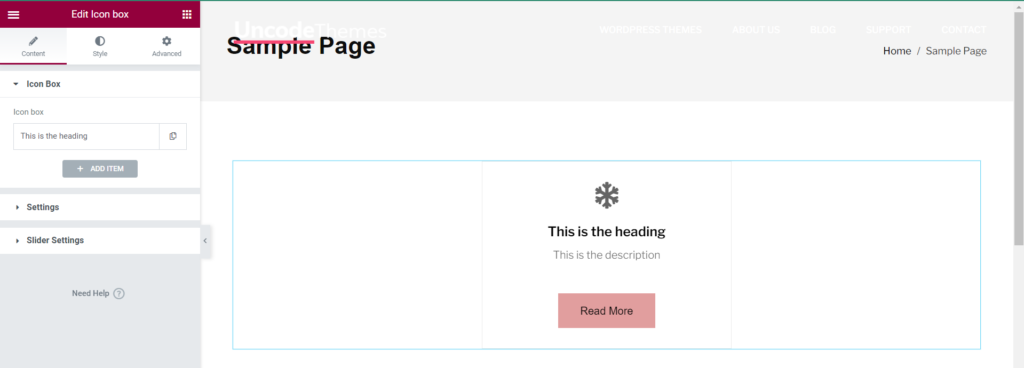
Now you can start to edit the content.
How To Use Icon Box Widget?
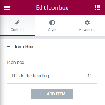
Content
Icon Box: The option allows to define the heading for the heading. ADD ITEM allows to add multiple Icons.
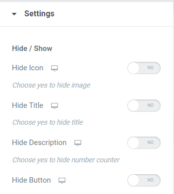
Settings
Hide/Show
Hide Icon: Enabling this option disables the Icon.
Hide Title: Enabling Hide Title disables the title.
Hide Description: Enabling Hide Description disables description.
Hide Button: Enabling Hide Button disables the button.
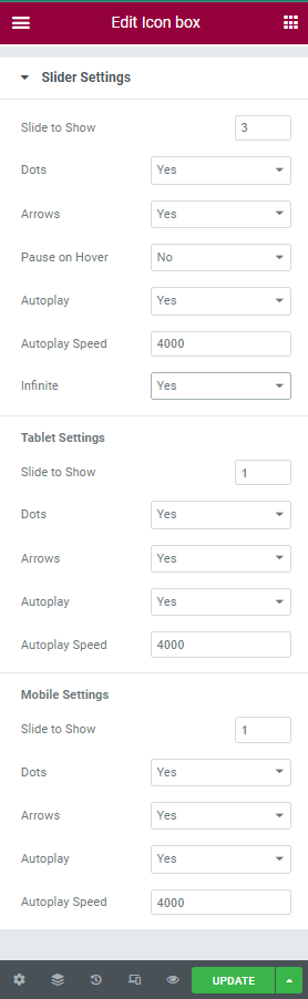
Slider Settings
Slide to Show: This option allows to define the numbers of items to show.
Dots: This option allows to set dots to Yes or No.
Arrows: This option allows to set dots to Yes or No.
Pause on Hover: This option allows to set to Yes or No.
Autoplay: This option allows to set Autoplay to yes or No.
Autoplay Speed: This option allows to set Autoplay Speed.
Infinite: This option allows to set Infinite option to Yes or No.
Tablet Settings: Tablet settings available are same as for slider settings.
Mobile Settings: Mobile settings available are same as for slider settings.
Style
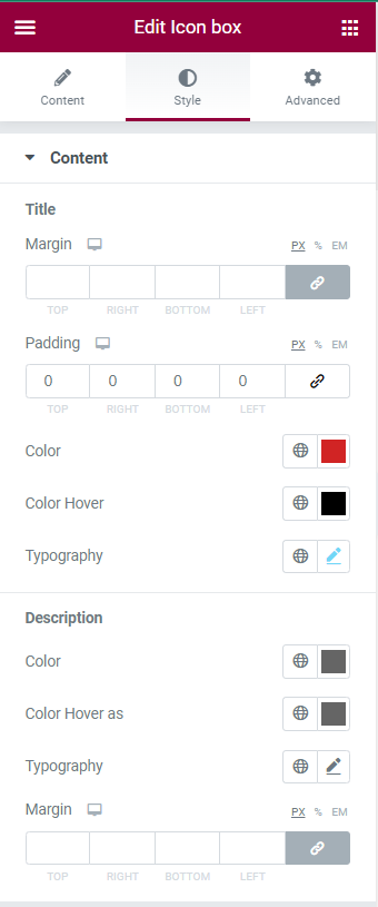
Content
Title
Margin: This option allows to set margin for the title of Icon Box Widget. Margin can be set at Top, Right, Bottom, Left.
Padding: This option allows to set padding at Top, Right, Bottom, Left.
Color: This option allows to define color for the heading.
Color Hover: This option allows to define color effect on hover.
Typography: This option allows to customize fonts for Heading.
Description
Color: This option allows to set color for description.
Color Hover as: This option allows to set color effect on hover for description.
Typography: This option allows to customize fonts for description.
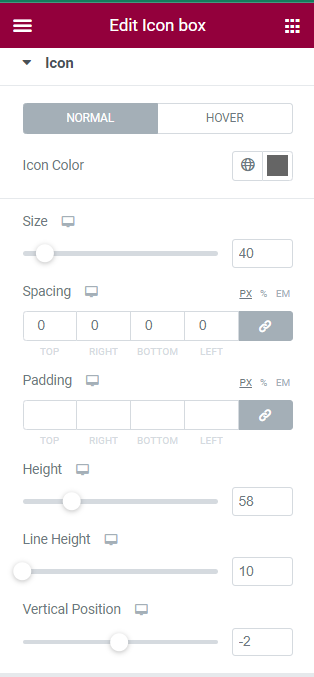
Icon
Normal and Hover
Icon Color: This option allows to define color for icon.
Size: This option allows to vary the size of the icon.
Spacing: This option defines the space between icon and border. It can be set at Top, Right, Bottom, Left.
Padding: This option allows to set the padding.
Height: This option defines the height between Icon and Heading.
Line Height: This option defines the height between Icon and top border.
Vertical Position: This option allows to set vertical position of Icon.
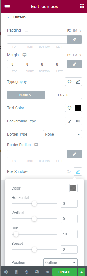
Button
Padding: This option allows to set the padding of the button. It can be set at Top, Right, Bottom, Left.
Margin: This option defines the margin of button at Top, Right, Bottom, Left.
Typography
Normal and Hover: Various options are available for text in button as Text Color, Background Type, Border Type(None, Solid, Dashed, Dotted, Groove, Double), Border Radius(Top, Right, Bottom, Left), Box Shadow(Color, Horizontal, Vertical, Blur, Spread, Position(Outline, Inset)).