Navigation Menus are a UltraPress theme feature which allows you to create navigation menus with built-in Menu Editor. Our Navigation menus you to create custom menus of you own and lets you change it looks to make the menu even more elegant. This visual menu builder allows you to make you the live changes and doesn’t require any code.
Now, you can build amazing menus for WordPress in record time! Let’s learn how.
How to add Nav menu?
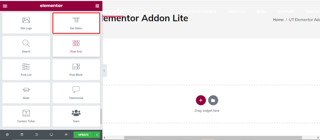
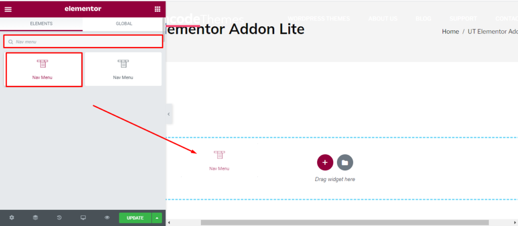
Open the page where you want to add the Nav menu and click Edit with elementor. Then in the search widget box, type “Nav menu”. Now drag the Nav menu to the region you need to add the widget.
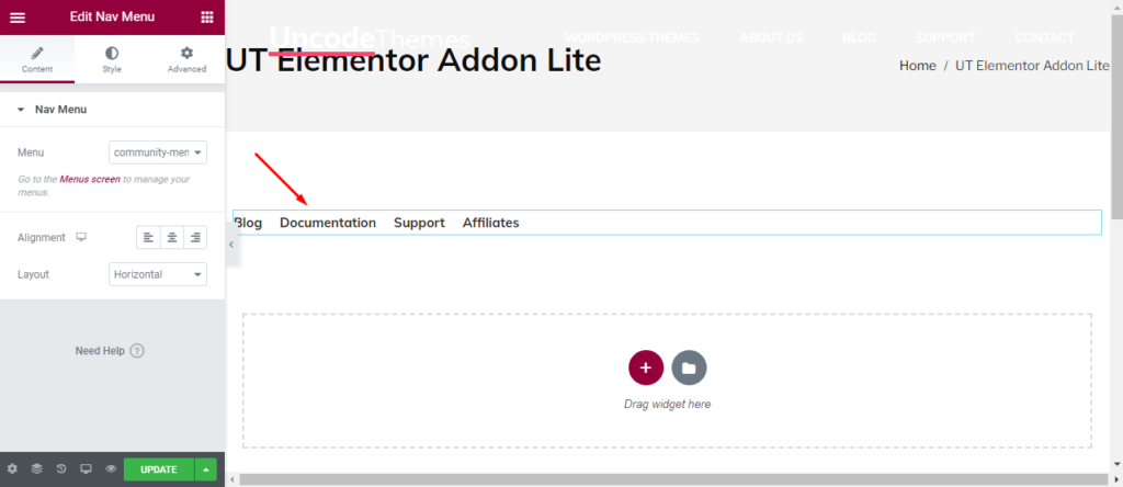
Once you drag the widget in the place you need, it should look like this.
Now you can start to edit the content.
How to use Nav menu widget?
Content
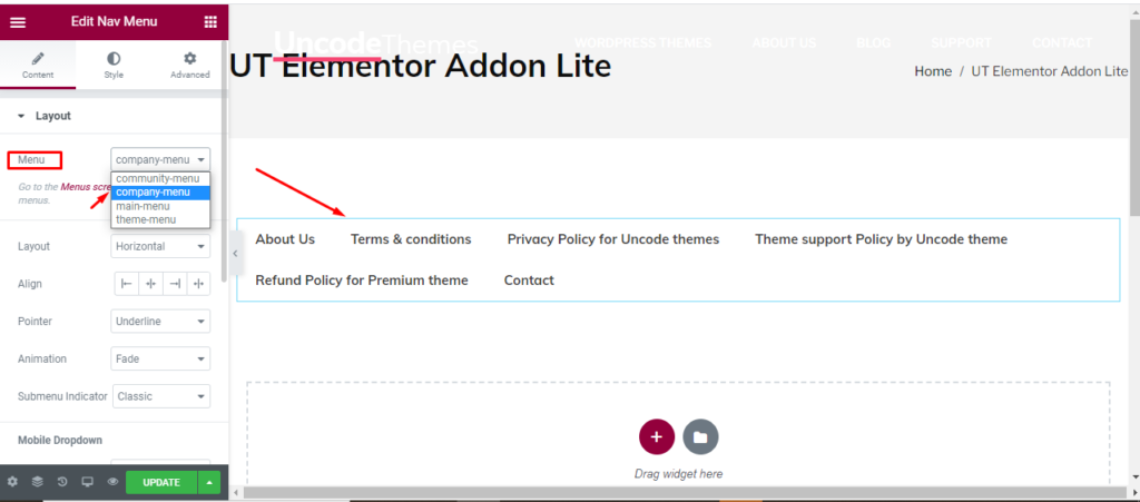
Nav menu: Here you can see 4 different type of menu options. Community menu is the default one with Blog, documentation, Support, and Affiliates. Company menu has more ingredient like Privacy policy, Terms and conditions, Contacts etc. Other options are main menu and theme menu.
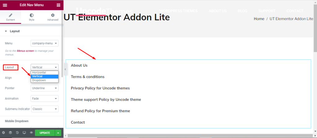
Layout: Three layout- Vertical. Horizontal, and Dropdown are available.
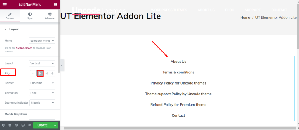
Alignment: You can place the menu in left, right, or the center.
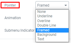
Pointer: You can make your menu even more attractive with different kinds of pointer.
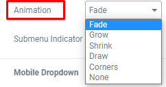
Animation: You might be amused to know that UltraPress allows to add beautiful animations even in the menu.
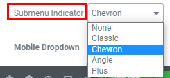
Submenu indicator: Most of the time, visitors miss the fact that you have submenu. Our beautiful indicators wont let that happen.
Mobile dropdown: Here, you can make your navigation menu responsive to different screens. Use the breakpoint, Full screen feature, Align, Toogle button, and Toogle align for mobile and tablet.
Style
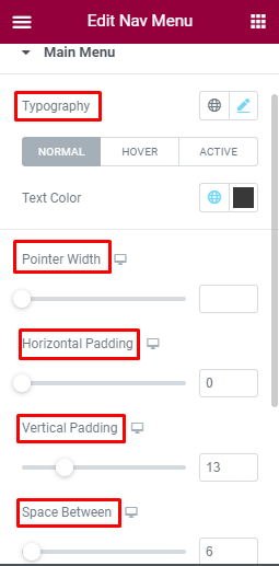
Main menu: Typography for Normal, Hover, and Active menu can be changed here. Also, you can edit the text color and Pointer width. Horizontal padding and vertical padding can increase or decrease the horizontal and vertical space. Space between will change the space between two menu.
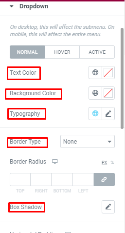
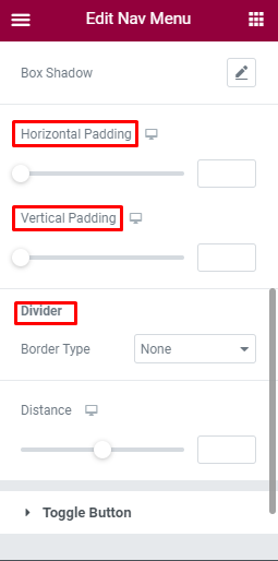
Dropdown: For the dropdown, you can change text color, background color, and Typography. Use of Border type will keep your dropdown inside a box. Horizontal padding and vertical padding can increase or decrease the horizontal and vertical space. Use of divider will separate two dropdown.
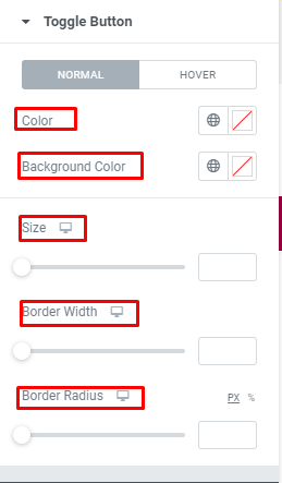
Toggle Button: Toggle button is like switch on and off for a website which helps users to set their preference. You can change the front color and background color for the Toggle. Also, you can make changes in Size, border width, Border radius.
Advanced
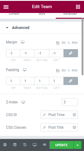
Advanced: Here, you can increase or decrease the margin between the column, and change the padding. Other options are Z-index for desktop, CSS ID, and CSS classes.
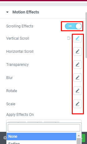
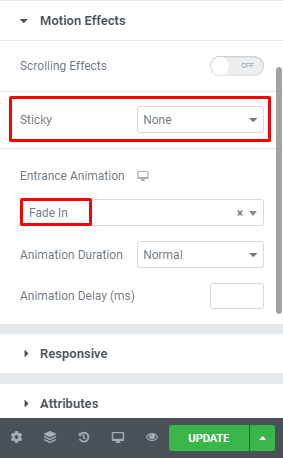
Motion effect: You can make your team section even more elegant by enabling the motion section. Once it is enabled, you can make other changes in the speed and looks. You can also enable or disable mouse effect, make it sticky to the top or button, and lastly change the entrance animation.
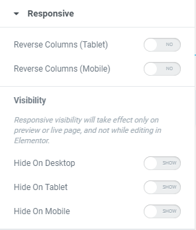
Responsive: You can make your team content responsive for tablet, Mobile and Desktop using this section.
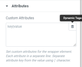
Attributes: You can set the custom attributes for the wrapper element. You can also use the dynamic tags.
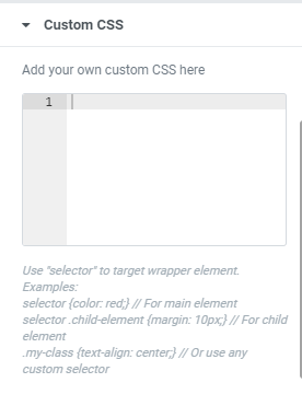
Custom CSS: Lastly, if all of these features are not enough, you can add your own CSS code here.